How to create a Lesson using the Drag and drop sorting Type?
You can use the Match and sort component to let your students sort the answers according to the question asked. Questions of this type are so interactive that every student will love to do this task.
When to use this Type
You can use this type of question where you want the students sort the answers given in multiple draggable boxes in an interactive manner
How it works
-
Instruction and question are provided in the description fields.
-
The first column contains draggable boxes. These boxes can be dragged. They are shuffled initially.
-
The boxes in the next column are called place holders or drop zones. You drag the answer boxes into these place holders.
-
User drags and drops the boxes with answers to the drop zones opposite to the relevant boxes with questions and clicks the Submit button.
-
If the user has sorted all the answers correctly, they will be highlighted in green. The Final Feedback is shown in the grey panel at the bottom of the page. The Submit button disappears.
-
If the user hasn’t sorted all the answers correctly, the wrong answers will be shown in red. The First Attempt Feedback is shown in the grey panel. The Submit button turns to Retry.
-
The user clicks the Retry button. All the boxes are reset to their initial places. Retry button turns to Submit again.
-
The user sorts the answers and clicks the Submit button. If the user has sorted all the answers correctly, they will be highlighted in green. The Final Feedback is shown in the grey panel at the bottom of the page. The Submit button disappears.
-
If the user hasn’t sorted all the answers correctly, the wrong answers will be shown in red. The Second Attempt Feedback is shown in the grey panel. The Submit button turns to Show.
-
The user clicks the Show button.
-
The boxes are shown correctly sorted. Final Feedback appears in the grey panel.
Features of this Type
-
You can place an optional heading for the page. The description text on the right side is also optional.
-
The First Attempt, Second Attempt and Final Feedbacks are also optional.
-
You can place an optional divider between the Description texts and boxes.
-
You can easily switch between matching and sorting just by clicking a checkbox.
-
You can easily design your draggable boxes and placeholders and assign the correct answers.
-
The boxes align themselves automatically and they are all in the same width and height.
-
The direction to drag the boxes is indicated by arrow marks.
Once you are in the slide in which this type of question should be added, you can create it by following the below steps.
Step 1: Add a Title (Optional)
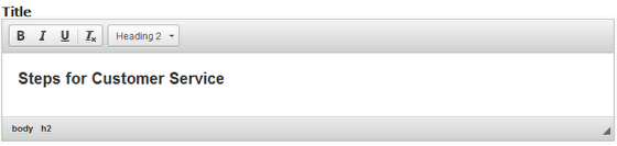
Type the title of the page on the Title field as shown in the above image. You can also change the format of the title. This field is not mandatory, and if you don't enter a title, it won't be shown as an empty space on the page.
Step 2: Add a Background Image (Optional)
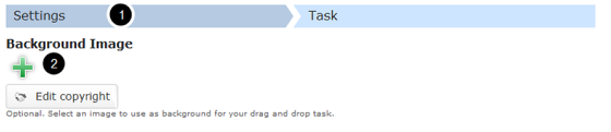
You can add an optional background image for the task in the Settings [1] tab by clicking the ‘+’ button under the Background Image [2] button as shown in the above image. You will get a screen similar to the one shown in the below image.
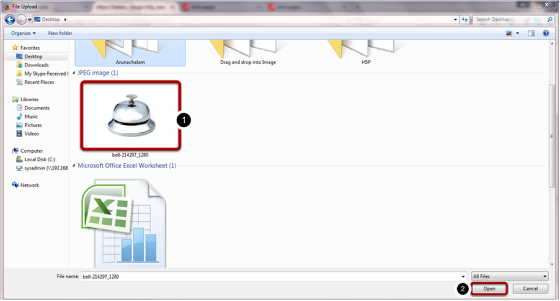
On the above screen, go to the required folder, select the required image [1] and click the Open [2] button. You can see image being uploaded as shown in the below image.
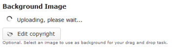
Once the image has been uploaded, it will be shown under the Background Image [1] title as shown in the below image.
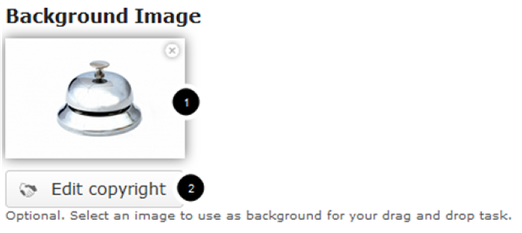
Optionally, you can update the copyright details of the uploaded image by clicking the Edit copyright [2] button shown above. Once you click the button, you will see the below screen.
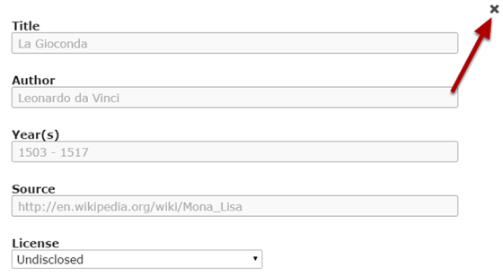
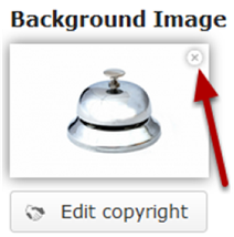
You can enter the image's copyright details on the above screen and click the Close button to update it. You can remove the uploaded image by clicking on the Remove file button shown on the below image.
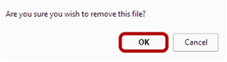
You will be prompted to remove the image as shown in the below image. Click OK to confirm and remove the image.
You can also update the image without removing it by clicking on the image. You will be offered to select the image again as mentioned in step 2.
Step 3: Add Description Left
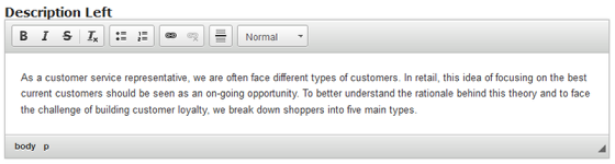
You can add contents to the Description Left field as shown in the above image. Just type the contents of the page in the Description field as shown in the above image. You can also change the format of the text, add and remove hyperlinks and insert horizontal lines between the contents
Step 4: Add Description Right (Optional)
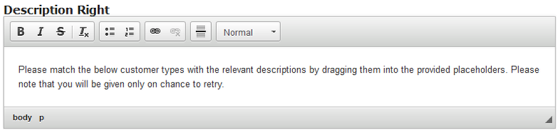
Similarly, you can add contents to the Description Right field as shown in the above image. Just type the contents of the page in the Description Right field as shown in the above image. You can also change the format of the text, add and remove hyperlinks and insert horizontal lines between the contents. Please note that this field is not mandatory.
Step 5: Enable Divider (Optional)

You can add a divider between the description texts and boxes. If you want to enable the divider, just check the Divider checkbox shown above. By default it is disabled.
Step 6: Enter the text for First, Second and Final Feedbacks (Optional)
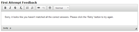
First Attempt Feedback is the feedback that appears when the user selects a wrong answer at the first attempt. Type the contents in the First Attempt Feedback field as shown in the above image.
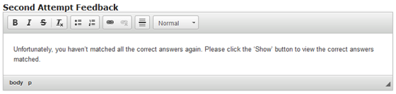
Second Attempt Feedback is the feedback that appears when the user selects a wrong answer at the second attempt. Type the contents in the Second Attempt Feedback field as shown in the above image.
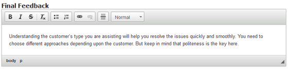
Similarly, Final Feedback is the feedback that appears when the user selects the correct answer at anytime. This is also the feedback that will be shown when the user clicks the Show button after selecting any wrong answer in the second attempt. Just type the contents of the page in the Final Feedback field as shown in the above image.
Step 7: Check the Inverse Arrow Checkbox
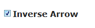
The direction to which the answer boxes should be moved is indicated by the arrow marks on the page. For matching, it should be < and for sorting it should be >. By default, the direction is set to right to left (<). You can change it by checking the Inverse Arrow check box shown above. Since we are creating a page for sorting the contents, we leave check this checkbox.
Step 8: Check the Sorting Checkbox
We need to check this checkbox only when you use this component for sorting. If you click this checkbox, only two columns will be shown. Since we are creating a page for sorting the contents, we need to check this checkbox.
Step 9: Set Task Size (Optional)
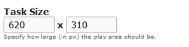
You can set the size of the task using the Task Size checkboxes shown above. By default, it is set to 620 X 310 pixels.
Step 10: Move to the Task Tab
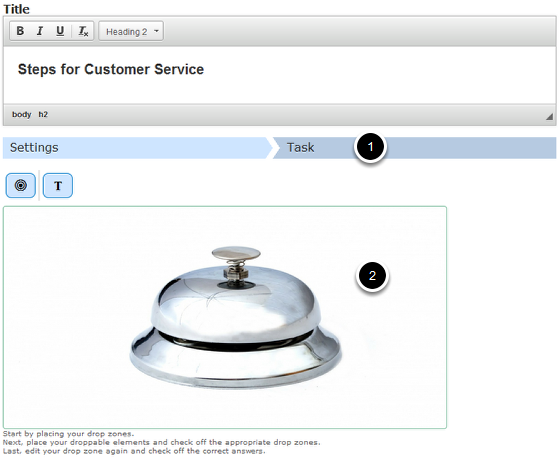
Once you've updated all the information in the Settings tab, move to the Task [1] tab shown in the above image. You can see a preview [2] of the uploaded image in the image.
Step 11: Add Drop Zones
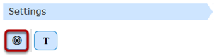
Start adding drop zones to the task. Drop Zones are the place holders where the users will drag and drop the answer boxes into. To add a drop zone click the Drop Zone icon shown in the above image. You will see the below screen.
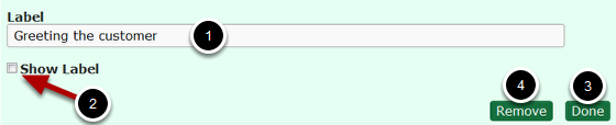
Type a label for the drop zone in the Label [1] field shown above. This label won't be shown to the user by default. If you want it to be visible, check the Show Label [2] checkbox. Once you've entered the label, click the Done [3] button. You can also remove the drop zone by clicking the Remove [4] button shown above. Once you click the Done button, you will see the below screen.

You can see the drop zone you just created on the top left corner of the uploaded image. You can just resize or drag and drop the drop zone to your desired place. Similarly you can add as many drop zones as possible.
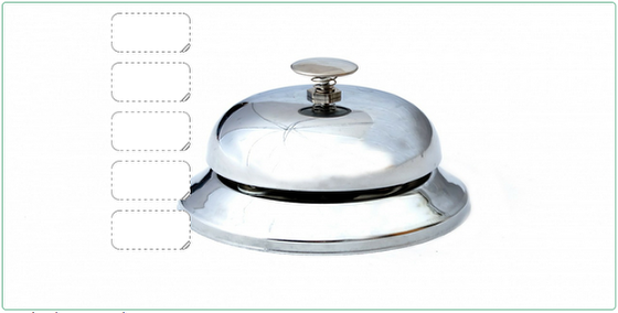
In the above image, you can see 5 drop zones being added to the task
Step 12: Add draggable Boxes
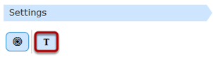
Now, you can start adding draggable boxes with answers. To add a draggable answer box, click on the Insert text icon shown in the above image. You will see the below screen.
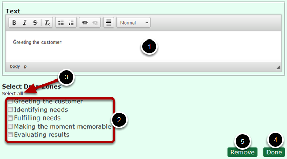
Type the label that would appear on the draggable answer box in the Text [1] field. You can also format the contents in the text field. Then select the drop zones where this specific answer box can be dropped into under Select Drop Zones [2] title. In our case, we select all the drop zones, because we want to be able to drag and drop all the answer boxes into any drop zone. To select all the drop zones just click the Select all [3] link shown above.
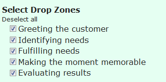
Now you can see all the drop zones have been selected. The Select all link is now changed to Deselect all. If you click this link, the answers will be deselected. We leave all the drop zones selected for our task. Then click on the Done [4] button to save the changes. You can also remove this draggable answer box by clicking the Remove [5] button. You will see the below screen.
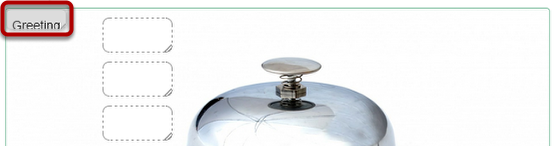
The just added draggable answer box is added to the top left corner of the task page. You can just resize or drag and drop the draggable answer box to your desired place. Similarly, you can add as many draggable answer boxes as possible.
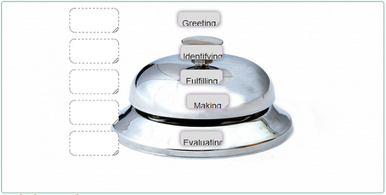
In the above image, you can see 5 draggable answer boxes being added to the task
Step 13: Shuffle the Answers.
Once you've added answers in draggable boxes, make sure you shuffle them, so that the answers won't be opposite to the boxes with questions. Just drag and drop the boxes with answers to make a random order of answers.
Step 14: Assign Order to the Answers
Once you've shuffled the answers, you can set which answers should be dragged into the appropriate drop zones. To do that, double click the first drop zone. You will see the above screen again. Check the checkbox with the correct drop zone's label [1] for the first question. Then click the Done [2] button.
You can click all the other drop zones and assign answers accordingly.
Step 15: Click the Done Button
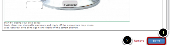
Once you've updated all the details, click the Done [1] button shown above to complete editing the page. You can cancel creating the page just by clicking the Remove [2] button shown above. If you click the Done button, you will see the below screen with a preview of the created page.
Step 16: Click the Create Button
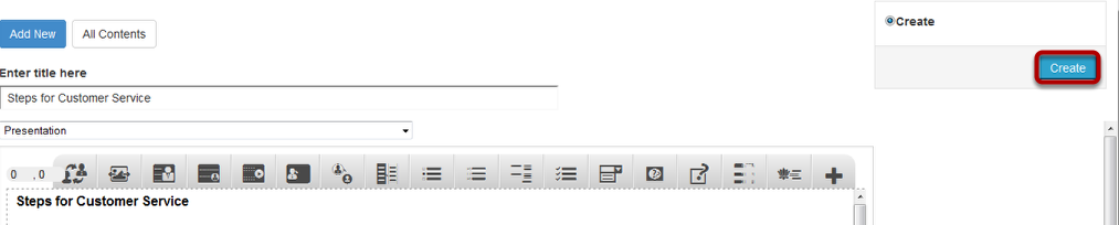
If you still want to edit the page, just double click on the preview page, and you will be taken to the Edit page. If you've done all the changes, you can click the Create button as shown above picture to finish editing the page.
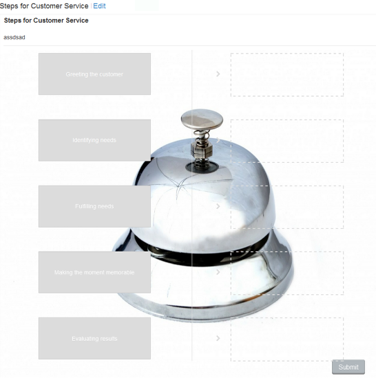
You can see the finished page as shown in the above image.
Notes
-
You can create as many pages as possible in a Presentation using this component.
-
You can add as many boxes with questions or answers as possible in a page.
-
The boxes align themselves automatically and they are all in the same width and height. So, feel free just to add the boxes and place them as approximately. You don’t even have to resize them.
-
You don't need to change the task size, because the component will adjust its background size as per the number of boxes you create.
-
Although the First Attempt, Second Attempt and Final Feedbacks are optional, if you leave these fields blank, then a grey panel without any content will appear below the boxes. To avoid this problem, enter ‘none’ in these fields while editing.
-
Make sure that you check the Inverse Arrow and Sorting checkboxes while creating lessons for sorting.
-
Draggable boxes are shown with soft round corners while editing. Label boxes have normal sharp corners.
-
While editing tasks, you can make any answer box draggable by double clicking it and selecting at least one drop zone.
-
Make sure you create equal number of drop zones and answer boxes.
-
Check the Show Label check box only if required. If you click this check box, the answer may become visible.